
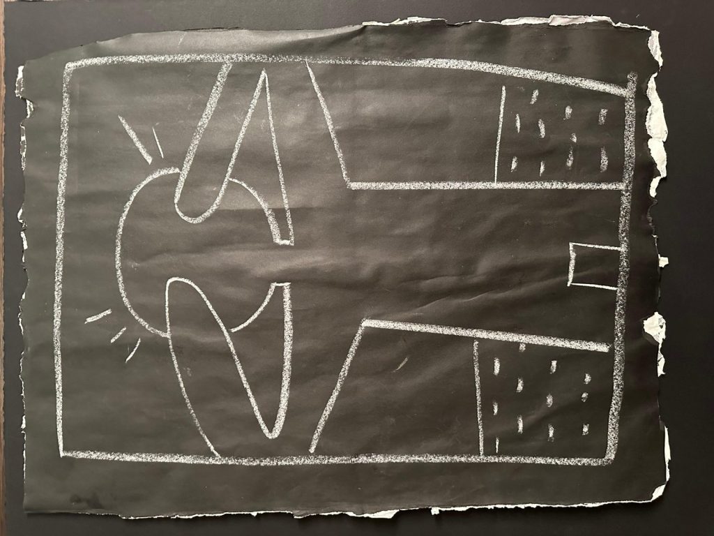
Keith Haring built much of his visual language around the human body. He reduced the figure to a small number of continuous lines, removing individual features while preserving gesture, movement, and interaction. In Man, white lines define a fragmented human figure against a black ground, creating a direct contrast that recalls one of the most important chapters of Haring’s career: his New York subway drawings.
Table of Contents
The work, executed in white on paper and measuring 46 × 67 cm, uses remarkably limited means. Haring relies on line, scale, and the relationship between positive and negative space rather than color or modeled volume. As a result, the human figure becomes both immediately recognizable and deliberately ambiguous.
Keith Haring and the Human Figure
Human figures appeared throughout Keith Haring’s career. Dancing, running, embracing, falling, and interacting bodies formed a central part of the vocabulary he developed in New York during the early 1980s. Alongside hearts, dogs, babies, and other recurring motifs, these simplified bodies allowed Haring to communicate through images that viewers could recognize quickly.
Moreover, Haring’s interest in semiotics — the study of signs and symbols — influenced this approach. He developed figures that function almost like pictograms while resisting a single fixed interpretation. His images could change meaning according to their gestures, surrounding symbols, and relationships with other forms. The Keith Haring Foundation describes his graphic expression as fundamentally based on the “primacy of the line.”
Man demonstrates this principle particularly clearly. The body requires only an outline. Haring eliminates facial features, anatomical detail, and conventional modeling, yet the figure remains unmistakably human.
White on Black: Haring and the Subway Drawings
The contrast between white line and black paper has particular significance within Keith Haring’s art. In 1980, Haring noticed empty advertising panels covered with matte black paper in New York subway stations. He began drawing directly onto them with white chalk, turning temporary advertising spaces into public artworks. Between 1980 and 1985, he created thousands of these subway drawings.
Haring valued the material precisely because of its simplicity. White chalk produced a strong, continuous line against the smooth black surface, while the subway environment required him to work rapidly. He later described the subway as a “laboratory” where he could develop and test his ideas.
Although Man should not be identified as a subway drawing without documentary evidence, its white-on-black graphic structure strongly recalls that practice.
Fragmentation and Movement in Man
Fragmentation distinguishes Man from many of Haring’s compact, immediately readable figures. The body expands across the composition and appears divided by the surrounding rectangular structure. Angular limbs intersect with curved sections of the torso, while short radiating marks suggest energy or movement.
Meanwhile, smaller geometric areas occupy the right side of the composition. Their repeated marks contrast with the sweeping outline of the body and introduce another rhythm into the image.
Haring therefore creates movement without conventional illusionism. Lines do not describe muscles, weight, or three-dimensional space; they communicate action. MoMA similarly characterizes his larger drawings through their combination of stylized figures and rhythmic graphic patterning. The Museum of Modern Art
Drawing as Direct Communication
Accessibility remained central to Haring’s understanding of art. His subway drawings reached commuters outside museums and galleries, while their simple graphic language allowed viewers to respond without specialized art-historical knowledge. Haring himself wrote that art gains its power through the experience of the observer. Haring
Man condenses that approach into a striking black-and-white composition. The figure requires only a few lines, yet those lines create body, movement, and visual tension.
Ultimately, Keith Haring’s Man demonstrates how reduction could increase rather than limit expression. By removing descriptive detail, Haring transforms the human body into a sign — simple enough to recognize immediately, yet open enough to invite interpretation.