
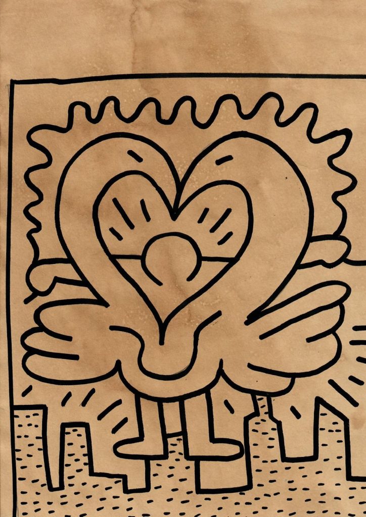
Keith Haring turned simple signs into a visual language that could communicate almost instantly. Hearts, dancing bodies, barking dogs, crawling babies, and radiating lines recur throughout his work, creating images that remain recognizable without requiring conventional narrative or realistic representation. The heart became one of the most familiar elements of this vocabulary. MoMA notes that hearts already appeared frequently in Haring’s drawings by 1982, alongside winged figures and other recurring symbols. (The Museum of Modern Art)
Table of Contents
In Heart, an ink drawing on paper measuring 31 × 20 cm, Haring combines several of these characteristic elements. Two large curved forms meet to create a heart, while a smaller heart appears inside them. Wing-like forms extend horizontally from the central figure, and short radiating marks introduce another recurring feature of Haring’s graphic vocabulary. Below, a simplified cityscape anchors the composition.
Keith Haring and the Heart Symbol
The heart occupies an important place in Keith Haring’s art. However, Haring’s symbols rarely function as fixed codes with only one meaning. His pictorial language depends on repetition, combination, and context. Museum Brandhorst emphasizes this openness when discussing his subway drawings: their recognizable outlines encouraged viewers to bring their own ideas and interpretations to the images. (Museum Brandhorst)
Therefore, the heart can suggest love and emotional connection without limiting the drawing to a single interpretation. Haring combines it with bodies, movement, wings, and radiating marks, allowing a familiar symbol to participate in a broader visual system.
In this drawing, doubling strengthens the motif. One heart surrounds another, while the larger form appears almost bodily. The result lies between symbol and figure: the heart remains immediately legible, yet Haring gives it a physical presence.
Line and Movement in Keith Haring’s Drawings
Line forms the foundation of Haring’s artistic language. His early New York subway drawings helped establish the continuous, direct graphic style that he maintained across drawings, paintings, prints, and murals. Writing published by the Keith Haring Foundation identifies flow, fluidity, and continuous line as central features of his practice. Харинг
Heart demonstrates that economy particularly clearly. Haring uses thick black contours rather than modeling, shading, or conventional perspective. Each form depends on its outline.
Meanwhile, repeated curves create movement throughout the composition. The outer heart bends inward, the internal forms repeat its contours, and the wings extend toward both edges of the sheet. Radiating lines surrounding the central image further activate the otherwise static symbol.
The city below introduces a different rhythm. Rectangular buildings and short horizontal marks contrast with the rounded forms above them, dividing the composition between a geometric urban base and the expansive organic shape of the heart.
Keith Haring: Art as Communication
Accessibility remained fundamental to Haring’s practice. During the early 1980s, he created thousands of chalk drawings on unused advertising panels in New York subway stations, bringing his imagery directly into public space. Museum Brandhorst records approximately 5,000 subway drawings produced between 1980 and 1985. Museum Brandhorst
Haring later explained that reaching a broad public formed part of his understanding of art itself: communication and participation in culture mattered to him. His simplified figures and symbols supported that objective because viewers could recognize them quickly across very different contexts.
Heart concentrates this approach within a small work on paper. A limited vocabulary of black lines produces a composition based on repetition, movement, and immediately recognizable signs. The heart provides the central image, but Haring’s treatment prevents it from functioning as a merely decorative emblem. Instead, the drawing shows how he could transform a familiar symbol through line, scale, rhythm, and visual association.
Kings Gallery is a leading fine art gallery established in Jerusalem in 1995. We strive to collect and sell the highest quality historic and contemporary Israeli and International art. The gallery specializes in artists from the early period of the 1920’s. In addition, Kings Gallery features leading up-and-coming young artists who will definitely be prominent names in the next few years.